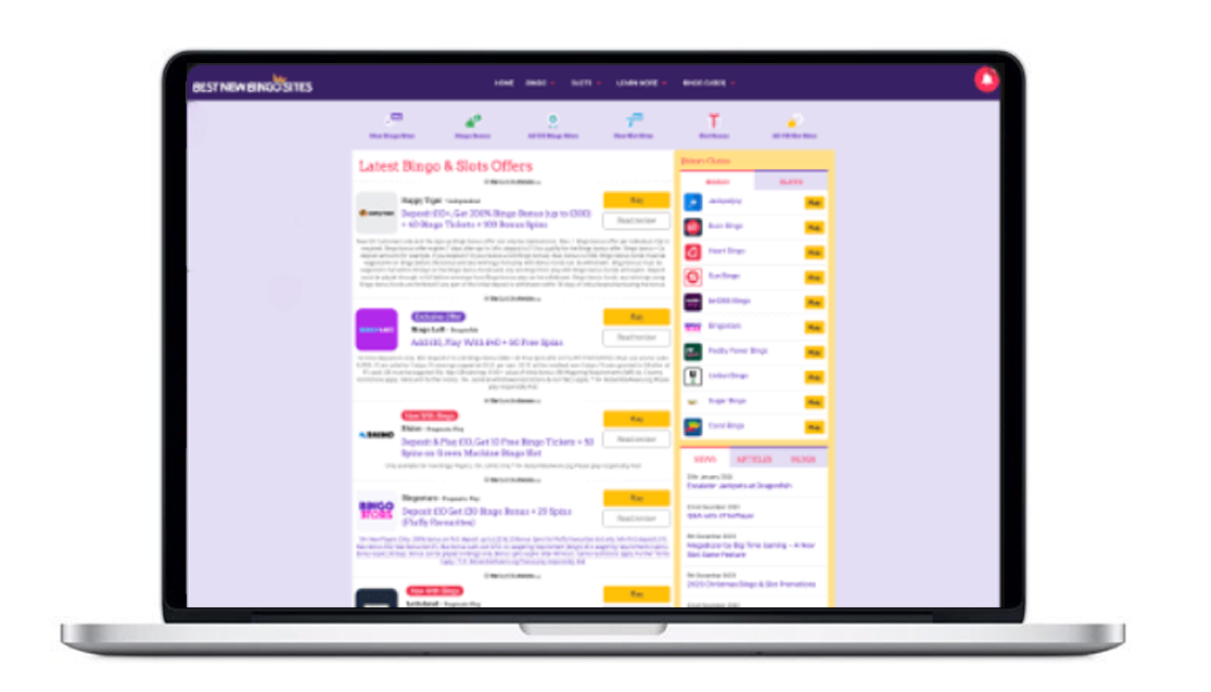
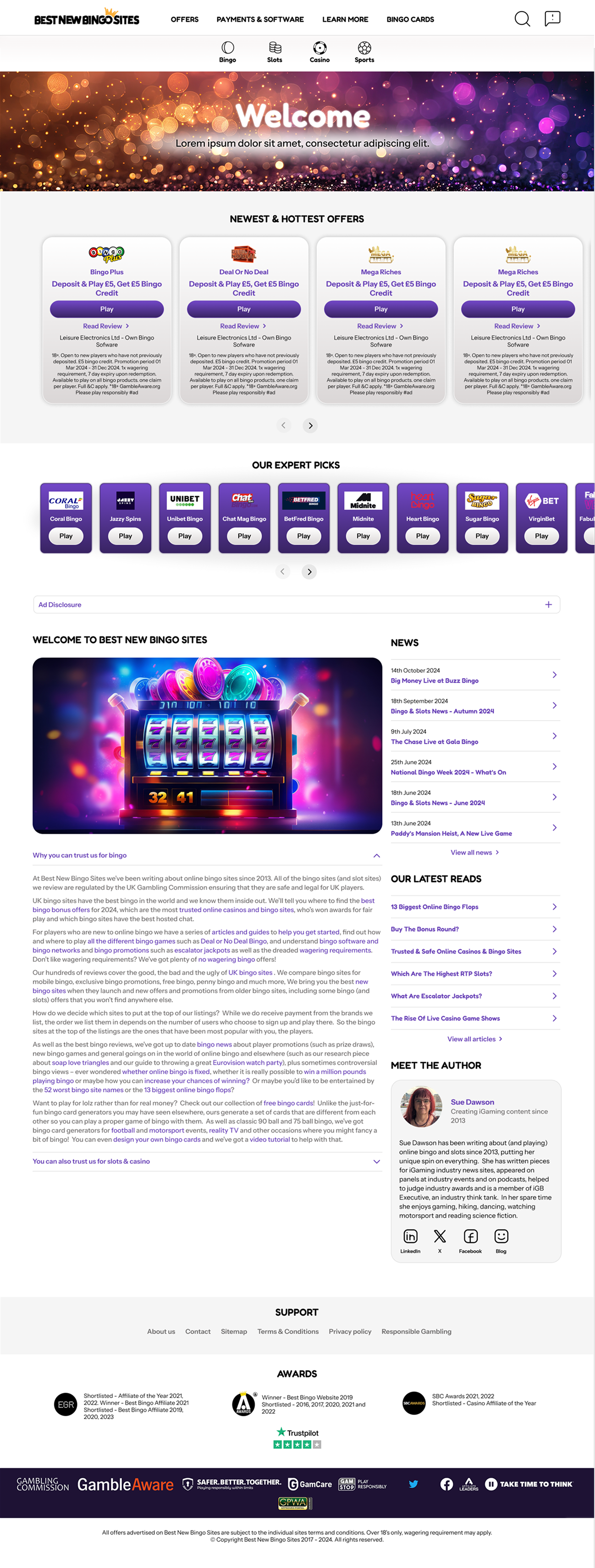
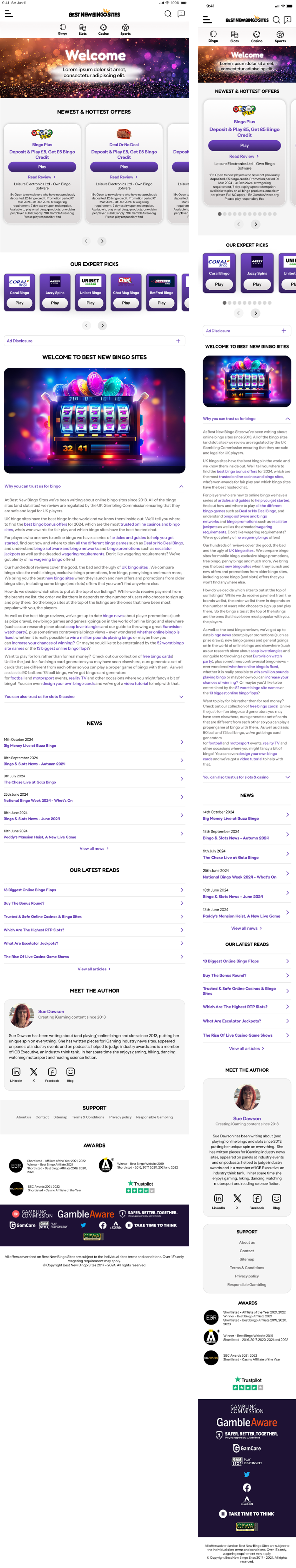
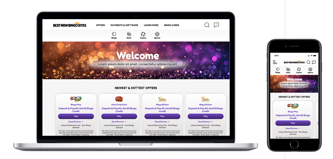
Case study - FTD Digital

Bingo site redesign

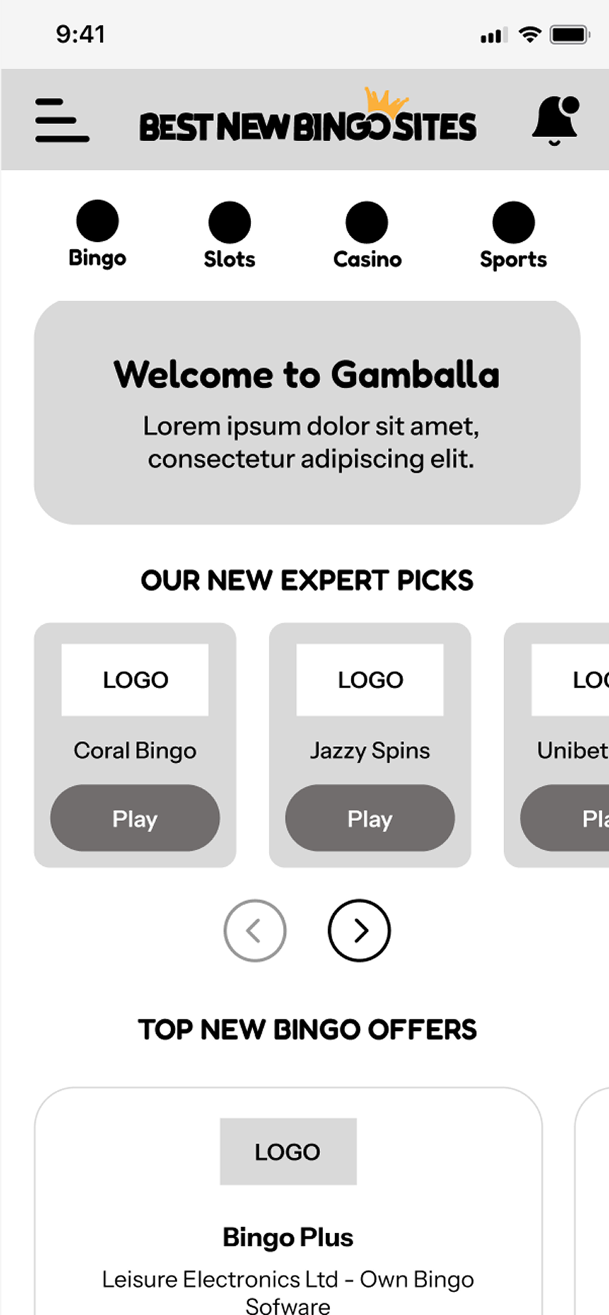
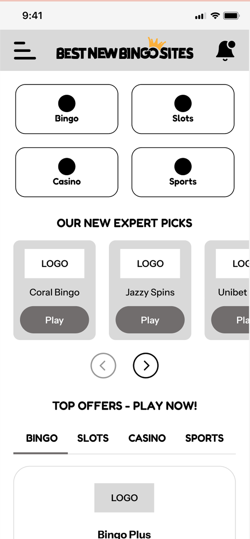
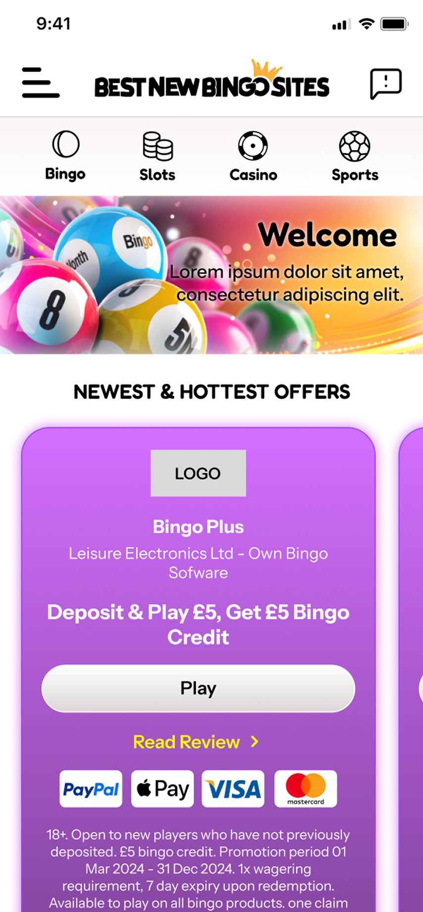
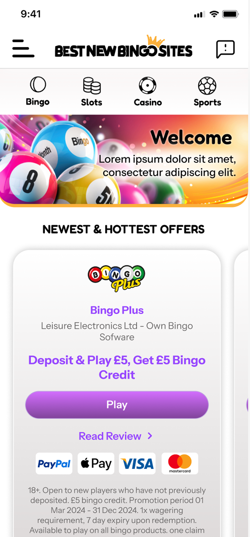
FTD Digital are an award winning iGaming affiliate. Working directly with the business owner & best new bingo sites author I was required to redesign the whole site. Given industry trends there was a strong emphasise on a mobile first approach. Using Microsoft clarity for analytics, heat maps & page scrolls of existing site I was able to asses the existing site & make key design decisions moving forward.

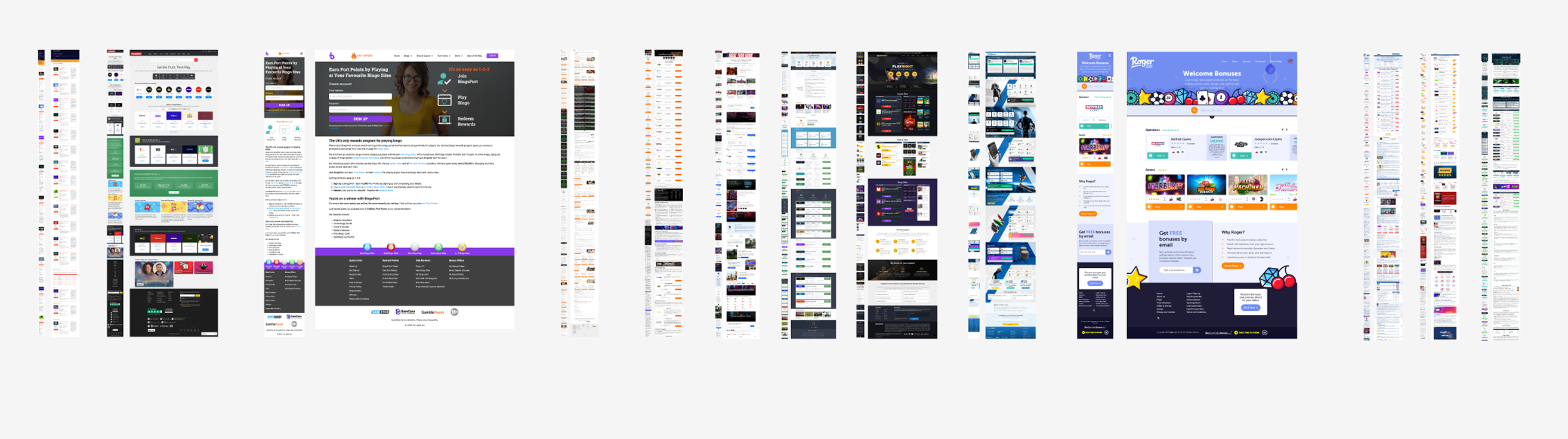
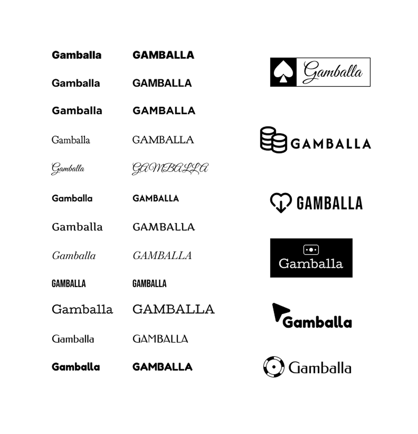
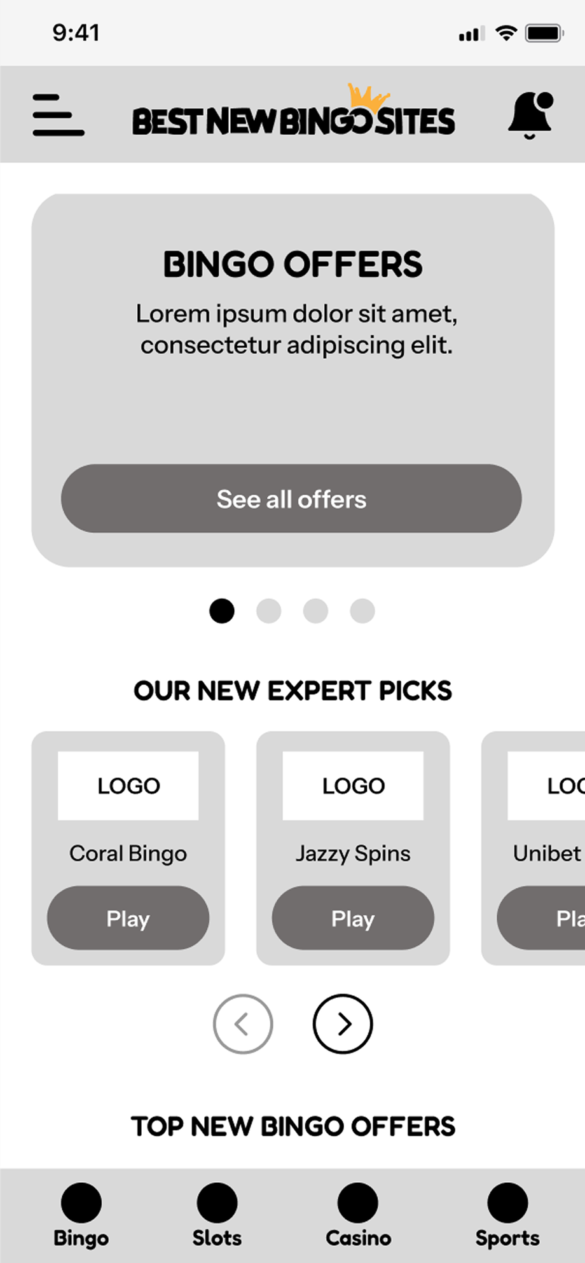
Research | Logo Design | Wireframing | Prototyping | UI Design

The problem in brief

Here we’ll look at best new bingo sites home page redesign as an example. The sites dated & there are various call to actions with no real design patterns & consistency across the site. For instance some primary CTA’s where the impetus needs to be are ghosted. Original old page design shown here.

Actions: Whilst keeping in close contact with the business owner I was working independently as the sole designer required to redesign the site. Carrying out research looking at how their closest competitors present themselves then using analytics to move forward with the redesign.

Competitor analysis

Initially collating a who’s who of competitors sites in order to get a flavour for industry trends. Looking for similarities & how the information is served up above the page fold. In both mobile & desktop.

Logo exploration

The business owner is thinking of a rebrand at some point in the future & would like to see some examples of a new logo design. Here I’m exploring different font style pairings. The preferred logo would require further development & refinement.

Initial wireframes

Utilising the preferred type face from the chosen logo I was able to start wireframing some options to present to the client. Here you can see the first three options in a mobile first approach.

UI progression

The UI was then progressed using various colour schemes & offer priority in terms of page content hierarchy. Different imagery was also preferential for the author of the site.

Final page design across breakpoints

Here you can see the final UI across breakpoints for desktop, tablet & mobile.

The solution

After looking at how the present page was performing by analysing the analytics, using Microsoft Clarity. Introducing 3 main CTA’s & a offer card that could be reused. I decided to move the main CTA’s/offers above the fold & reordered the page content in terms of hierarchy given click counts over time.

Working with the sites author we refined the colour pallet & brought in new imagery for the hero. Then shared with the dev’s from their preferred Wordpress development agency. Who would handle the CMS side.

View mobile prototype here
View tablet prototype here
View desktop prototype here

Let's work together
07821 722 397